
Have you ever wondered why financial advisors quote statistics, charts, and graphs?
The data contained in statistics, charts, and graphs used by advisors often backs up the plans created for our clients; it provides the evidence needed to help clients (or readers) stay in the game when emotions begin to cloud their decisions.
Be careful though, the data can also provide the additional fear needed to sell investment products investors might grow to regret, so investors need to understand how the data is being used.
The Classics
- “The market is up 7 out of 10 years.”
- “On average, we experience 10% declines every 16/17 months”
- “Bear markets occur about every 3 years, and on average last about a year, give or take a couple of months.”
While these statistics tell us nothing about what is currently going on in the market and are centered around averages, a number we hardly ever see, it provides some context for investors: we are not experiencing anything abnormal. If a bear market occurs approximately every 3 years, then experiencing one in the near future would not be out of the ordinary. If we happen to be in a bear market or are headed toward one (I’m not making any predictions), then we might be in for a year or so of discomfort, which is not as scary as the doom and gloom portrayed in the financial media.
I’ll be the first to admit, I doubt my clients’ initial reaction to hearing these types of statements is one of relief, but I do believe it helps them focus back on their plan and why we have their assets invested. The only evidence I have to support this belief is my personal experience, and to this date (knock on wood) I’ve yet to have a client force my hand and sell them out of their investments against my advice. So far, so good.
It’s Not Just Numbers
Financial advisors love charts just as much as statistics. Here are a few of my favorites:
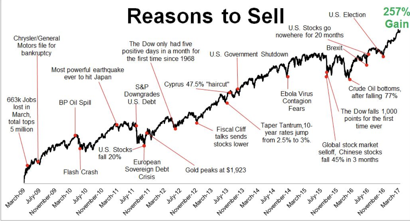
I stole this one from Michael Batnick’s blog post, “Gradual Improvements”, because it shows many of the narratives investors have heard over the years, all of which would have given them justification for selling out of the market. In the moment, these events were scary, even traumatic, but the wrong course of action would have been to sell. Looking back over time and remembering the emotions experienced and then seeing, along with hopefully participating in, the recovery and continued long-term move up and to the right can instill just enough confidence to stick with their plan and not react at the wrong time. And this chart just highlights the last few years, it can be expanded upon (and has been) to go much further back in time.
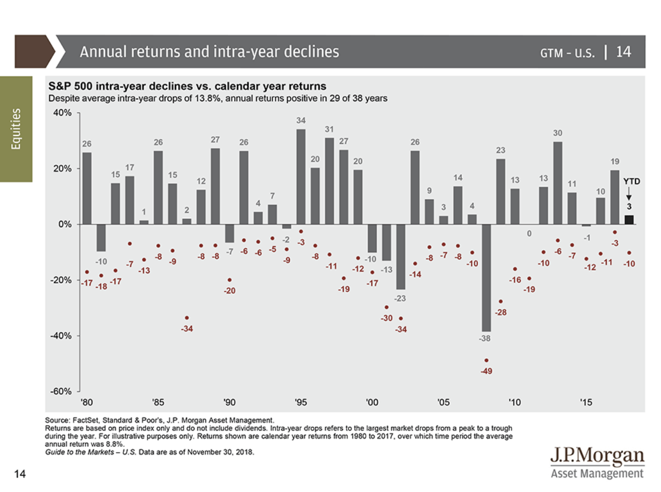
JP Morgan’s Guide To The Market is filled with great research and charts; this one shows investors the lowest and highest points in a given year. Seeing a drawdown even in the best years serves as a reminder that markets go down and declines are normal. It’s all a part of the deal if you’re an investor. I know this chart doesn’t make the decline being experienced any more fun, but it should remind investors they’ve been there before and they lived to save and invest another day.
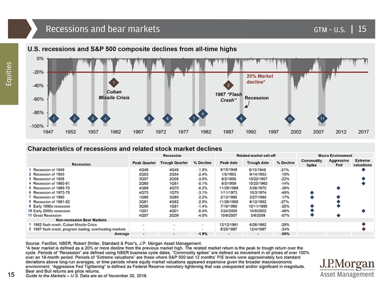
I wouldn’t typically break this chart out, another from JP Morgan’s Guide To The Market, but with all of the talk about a bear market recently, it could get some love soon. Again, using the data to remind investors of past recessions, allowing them to see the market declines associated with them, and showing that not every recession leads to a 2008 market decline. Maybe the next one does, but maybe it doesn’t. Market pundits may claim to know what is in store, but they don’t–neither do I.
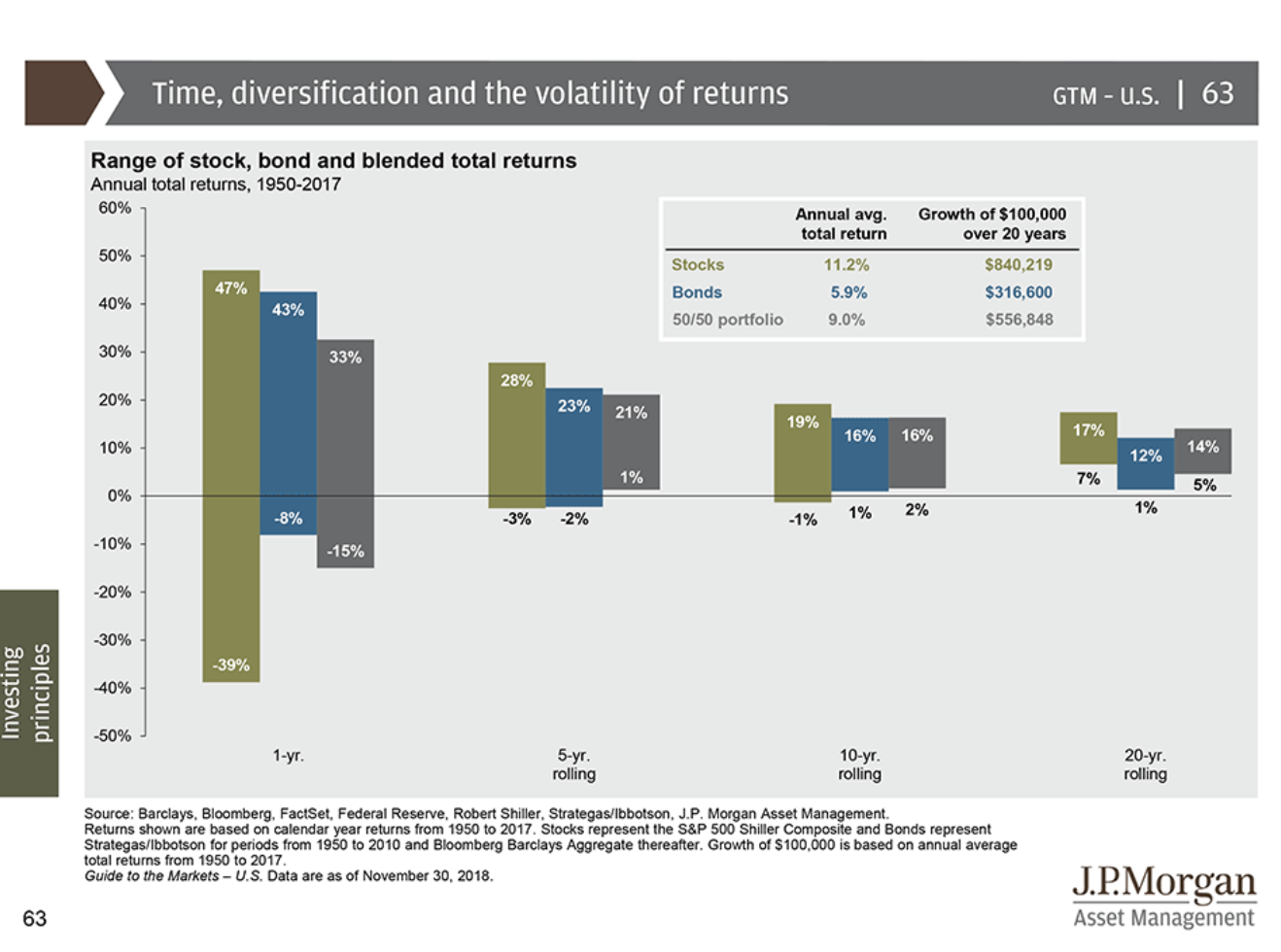
A couple of classic charts found in JP Morgan’s Guide To Retirement (and have been published by other companies as well) support the old saying, “it’s time IN the markets, not timing the markets”. Investors can see a longer time horizon results in better odds of having a positive investing experience; it should also remind investors any funds they will need in the short term should not be invested in the market.
Could you imagine needing funds for a closing on your new home in today’s market environment? I had a client who just closed on a new house this past Monday. We moved the funds needed to cash when they began the building process, over 6 months ago–not because I knew the market was going to struggle into the end of the year, but because the evidence shows the shorter the investment time horizon, the higher the probability of experience a loss; the funds would be needed in a short time, which meant there was no need to risk them.

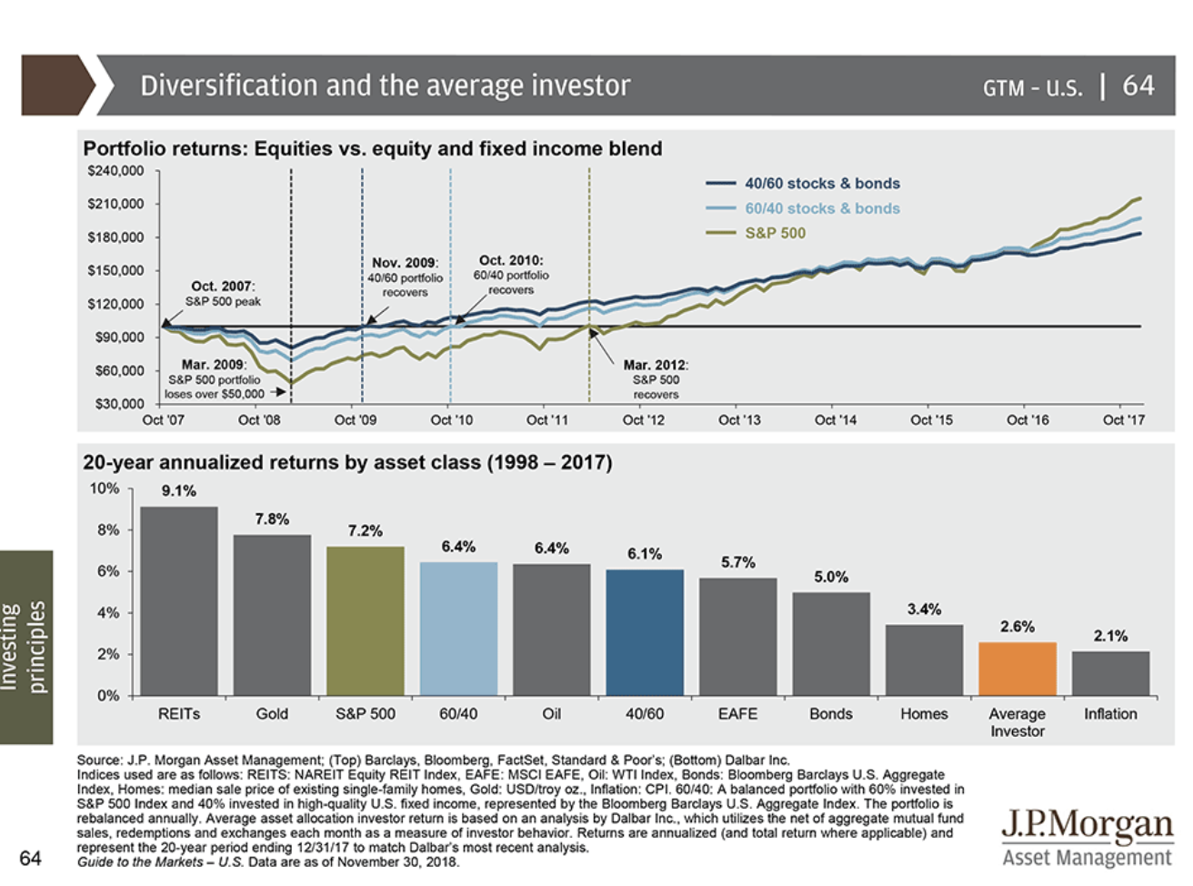
Finally, the famous Dalbar study showing the underperformance of the average investor, which can primarily be attributed to poor decisions. Selling at the wrong time, FOMO, untimely distributions and more. You’ve probably seen this one before, so I’ll skip the additional commentary–it speaks for itself.
The data tells important stories, stories which should be used to support a financial plan. It’s not easy being an investor, even with a financial plan. However, with an advisor to remind you of the “why” behind your plan, that whatever is going on at the time is really not that much different than what has been experienced before, and for most, the best course of action is to stick to the plan, the likelihood of an error in judgment being made is reduced.
If you come across someone using charts like these to sell products, scare you into making changes, or anything else that doesn’t seem like it is in your best interest, run the other way. Just as statistics can be used for good, they can be used for bad…but that’s a topic for another day, in a blog I’ve already started but haven’t been able to finish.
Sources:
The Irrelevant Investor: Gradual Improvements Go Unnoticed
JP Morgan Guide To The Markets 4 QTR 2018
JP Morgan Guide To Retirement 2018
Music Video:
Hopefully evidence like the statistics, graphs and charts can help you and your financial plan…..WIN, WIN, WIN!
Disclaimer: Nothing on this blog should be considered advice, or recommendations. If you have questions pertaining to your individual situation you should consult your financial advisor. For all of the disclaimers, please see my disclaimers page.


2 thoughts on “Why Financial Advisors Love Data”
Comments are closed.