Although we have recently experienced some positive days in the stock market, we continue to remain in a downtrend, which began last summer. I’ve had a few clients ask about this downtrend, so I thought I would write about what a downtrend is, and how to identify if we are in one.
First, let me start with the definition of a downtrend: simply, a downtrend is a movement lower in the price of an index, or stock, over a period of time. It can be identified by a series of lower highs, and lower lows in closing prices–let’s take a look at a couple of charts to better understand and identify a downtrend. I’ve selected the ETF that tracks the S&P 500, SPY, to review.


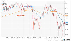
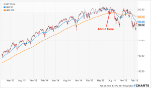
When looking for a downtrend, it is helpful to look at charts of different time periods. The varying time periods can help identify how long the downtrend has been in effect, along with when it started. To the left are charts for the 1 and 3 year daily prices of SPY (Click the charts to enlarge). You can see numerous red and black bars moving around the chart; those “bars” are actually called candlesticks, and they represent the daily movements of the price of SPY. Red candlesticks represent days SPY closed down (lost $), and black represent days SPY closed up (gained $). These candlesticks tell us much more than just if SPY was up, or down for the day, but that is outside of the scope of this post.
You can also see a blue and an orange line. The lines represent the 50 (blue) and 200 day (orange) Exponential Moving Averages (EMA). A moving average is a line that represents the rolling average of the previous days’ closing prices during the time period, in our case 50 and 200 days. If you’ve spent time looking at charts before, you may be more familiar with the Simple Moving Averages (SMA). The difference between the EMA and SMA is how they are calculated. Without getting too far in the weeds, the EMA is calculated with the most recent closing prices given more weight than older closing prices. This allows the EMA to reflect recent news and events, which would be muted using the SMA. It is not uncommon for the EMA and SMA to be very close in value, which makes it hard to determine which is the best indicator. It comes down to personal preference; I actually use both, but prefer the EMA because I like knowing recent news and events are reflected in the value.
If you take a closer look at the moving averages, you’ll notice that they are both trending down to the right, which is the obvious sign of a downtrend. I took the liberty of marking the approximate starting point of the current downtrend. You’ll also notice the 50 Day EMA is below the 200 Day EMA on both charts. This isn’t a good signal, but it’s also not the signal of the next Great Depression. The downward sloping blue line below the orange line illustrates prices continuing to move lower and a strong downtrend. We want to see the blue line turn upward, make its way toward the orange line, and pass through it. Eventually, the upward moving blue line will begin to pull the orange line up, and we’ll be back in a strong uptrend. Unfortunately, the chart doesn’t tell us when that will happen, but it does allow us to see when that turn starts to occur.
So, how do we use this information to help us? Depends. If you are a long term investor, you don’t. If you are a long term investor with a time horizon of 10, 15, 20, or 30 years you do nothing; stick with the financial plan that you have developed with your financial advisor, and adhere to the investment strategy. If you are a long term investor, you use this information to understand what is occurring in the markets and with your investments, but that’s about it. Continue to save into your 401(k)s and Roth IRAs; continuing to save into a declining market allows you to take advantage of buying more at lower prices. And when the trend shifts, you will have more shares participating in the uptrend. For those investors not needing to access their investments for years, downtrends are actually a good thing. You can think of it as a sale, and we all love a good sale!
If you are a short term investor, trader, or expect to make short term profits, then these charts can be extremely helpful, but this post isn’t for you. There are plenty of other sites focusing on your interests.
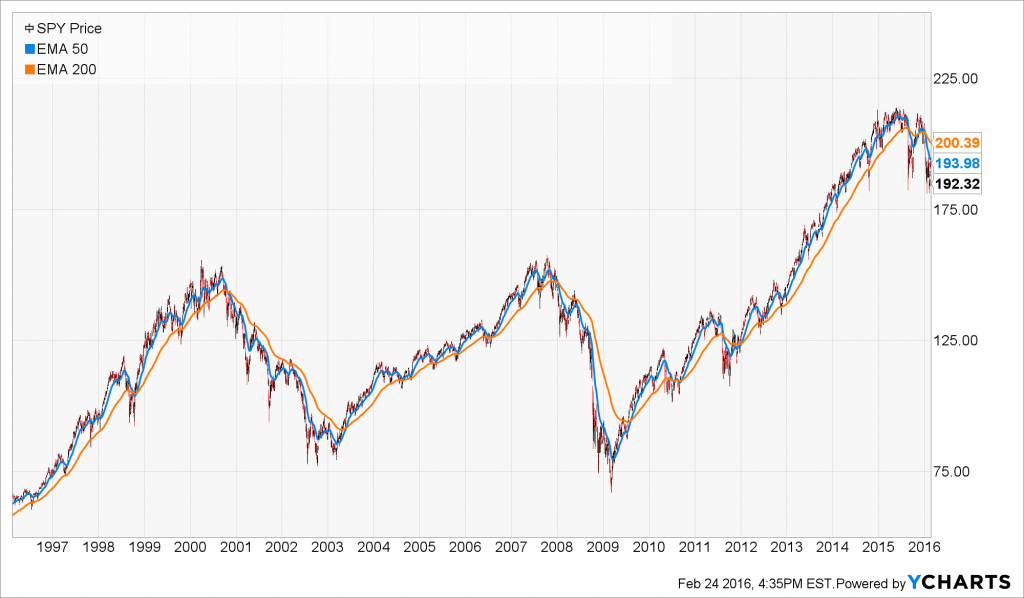
One thing to remember is downtrends are normal occurrences for long term investors. It is the price we have to pay in order to play the game. As you can see below, over a 20 year period there are a number of downtrends, and there is significant time where the 50 day EMA is below the 200 day EMA (blue below orange). But, despite those periods, the long term trend is upward–the direction we want to see it go!

This post was brought to you with the help of J Dilla. I often listen to music as I write, and I will provide my soundtrack on each post.

Disclaimer: Nothing on this blog should be considered advice, or recommendations. If you have questions pertaining your individual situation you should consult your financial advisor. For all of the disclaimers, please see my disclaimers page.


